

Summary Unavailable
This book is not suitable for a summary (it may be a textbook, workbook, cookbook, reference book, or collection). However, you can still explore the FAQs, about author, and other metadata below!
Key Takeaways
Every image is built from seven components you can master
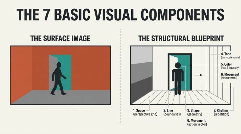
The invisible cast in every frame. Bruce Block argues that just as stories are built from plot, character, and dialogue, every picture ever made (film, video game, painting, commercial, or phone screen) is constructed from seven basic visual components: space, line, shape, tone, color, movement, and rhythm. Actors, props, and costumes are all just arrangements of these seven elements.
You cannot opt out. You can shoot in black and white to remove color, but the other six components exist in everything, even a blank screen (space, line, shape, tone, movement). Ignore them and they structure themselves anyway, usually working against your story. Understanding them lets a director, cinematographer, or designer control mood, unity, and style as deliberately as a writer chooses words.
Block's move is a reductionist one, borrowed from the fine arts tradition of Kandinsky, Klee, and his teachers Eisenstein and Vorkapich. Reducing infinite visual variety to seven controllable variables is pedagogically brilliant, giving novices a checklist where they previously had only vague instinct. The claim echoes music theory, where twelve notes generate all Western composition. A skeptic might ask whether seven is the right number or merely a convenient one, since semiotics and Gestalt psychology slice perception differently. But the practical payoff is real: naming a thing makes it controllable, and Block insists these components are always working whether or not the maker notices.
Contrast raises visual intensity; similarity lowers it
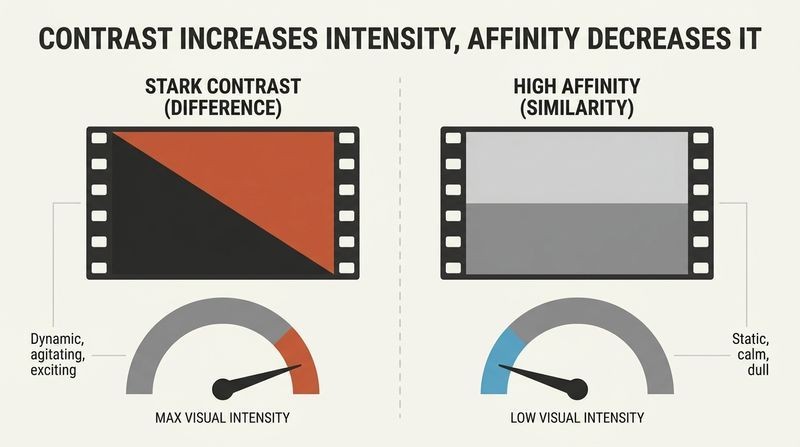
The single principle behind all structure. Block reduces visual control to one law he calls the Principle of Contrast and Affinity. Contrast means difference; affinity means similarity. The greater the contrast in any component, the more visual intensity (the dynamic, exciting, agitating quality) increases. The greater the affinity, the more intensity drains away.
Two thought-experiment films prove it. Imagine a movie that flickers black, white, black, white every second for minutes: pure contrast, unwatchably intense. Now imagine a movie of one unchanging gray frame: pure affinity, unbearably dull. Great pictures live between these poles, modulating intensity. This principle applies to all seven components and operates at three scales: within a single shot, from shot to shot, and from sequence to sequence. Master it and you can dial a scene's energy up or down at will.
This is the load-bearing idea of the entire book, and its elegance is its strength. Contrast and affinity map neatly onto information theory: contrast is high information (surprise, difference, signal change), affinity is redundancy (predictability). The nervous system is literally built to detect change, which is why contrast reads as intensity and habituation dulls the unchanging. The framework also parallels tension and release in music. One limitation worth noting: intensity is not the same as meaning or quality. A film can be relentlessly intense and emotionally hollow. Block's own caution applies: this is not math, and a calculator cannot produce great pictures.
Depth on a flat screen is an illusion built from stackable cues
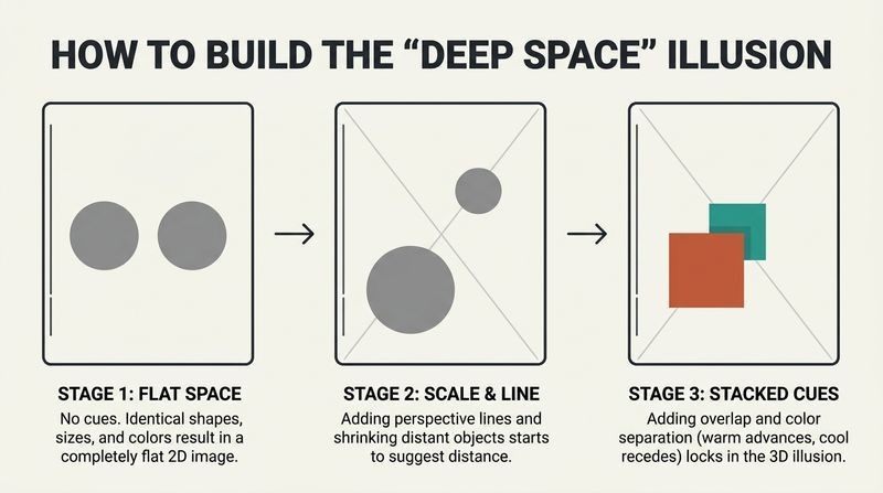
Faking three dimensions. A screen is strictly two-dimensional, yet audiences accept believable depth. Block calls this deep space, and it is manufactured entirely through depth cues that the eye reads as distance. The most powerful is perspective: parallel lines converging toward vanishing points, like railroad tracks meeting on the horizon.
Stack cues to deepen the illusion. Other cues include size difference (known objects shrink with distance), relative movement (foreground objects appear to move faster than background), textural diffusion (detail fades far away), aerial diffusion (fog or smog graying distant objects), tonal and color separation (bright and warm advance, dark and cool recede), overlap, and focus. Orson Welles built Citizen Kane's depth on perspective and size change. To shoot deep space: emphasize longitudinal planes, stage objects toward and away from camera, keep the camera moving, and use a wide-angle lens.
Block's inventory of depth cues aligns closely with vision science, where researchers catalog monocular cues (perspective, occlusion, texture gradient, aerial perspective) versus binocular ones. His practical insight, easy to miss, is that these cues stack and reinforce, so removing perspective while keeping size change yields a hybrid space. Notably, he punctures a common myth in his appendix: lenses do not compress or deepen space. All lenses share the same depth of field at equal image size; a wide lens creates depth only by forcing objects closer to the camera. This corrects a persistent misconception among working filmmakers who credit the glass rather than the geometry.
Choose one of four spatial worlds to match your story's mood
Four spaces, four feelings. Block classifies visual space into four types, each with a distinct emotional texture:
1. Deep space: full depth illusion, inherently intense (Touch of Evil).
2. Flat space: emphasizes the two-dimensional surface, low intensity, claustrophobic (Klute, Manhattan).
3. Limited space: depth cues minus longitudinal planes, a stacked series of frontal planes like sheets of glass (Bergman, Hitchcock).
4. Ambiguous space: size and spatial relationships are unreadable, breeding anxiety and used in horror.
Space is a storytelling choice, not a default. In Witness, the rural Amish world is flat and the corrupt city is deep, so space itself dramatizes the moral contrast. A story about entrapment might stay flat throughout; a millionaire's dark complexity might stay deep. Block also flags open space, a rare, thrilling effect where powerful movement seems to burst past the frame lines, as in the opening spaceship of Star Wars.
The typology's real value is prescriptive: it converts a vague directorial hunch (this scene should feel trapped) into concrete camera and staging decisions (stay flat, kill the longitudinal planes, use a zoom not a dolly). This resembles how architects manipulate ceiling height and sightlines to shape emotion. One nuance Block himself concedes: only open and ambiguous space carry fixed emotional meaning; deep, flat, and limited are neutral until the story assigns them significance. That caveat is important, because it resists lazy stereotyping. Flat does not universally mean sad. It means whatever the exposition trains the audience to feel, which is a more sophisticated, semiotic view of meaning.
Diagonal lines feel most intense; horizontals feel calmest
Lines exist only in your head. Block insists a line is a perceptual event, not a physical object, appearing only where tonal or color contrast reveals it. He identifies seven ways we perceive lines (edge, contour, closure, intersection of planes, imitation through distance, axis, and track) and a picture's dominant lines form its linear motif, revealed by squinting or a contrast viewing glass.
Orientation controls energy. Among line orientations, the diagonal is most dynamic, the vertical less so, and the horizontal least intense. This is why an off-kilter, tilted camera feels agitated and a level horizon feels serene. Shapes follow the same logic: circle, square, and triangle are the three basic shapes, and the triangle, being the only one containing a diagonal, reads as an arrow, the most aggressive and dynamic form. Reduce any car, face, or tree to a silhouette and it resolves into one of these three.
The diagonal-equals-intensity claim has robust support in perception research: the visual system processes oblique orientations less efficiently than cardinal ones (the oblique effect), and diagonals imply instability because they resist gravity's vertical and the ground's horizontal. Dutch angles in thrillers and the tilted compositions of German Expressionism exploit exactly this. Block's shape reductionism (everything is circle, square, or triangle) echoes Cezanne's famous dictum about the cylinder, sphere, and cone, and Bauhaus design pedagogy. His warning against emotional stereotypes (curves equal soft, triangles equal menace) is wise, since these associations are culturally learned defaults, not laws, and the strongest work often subverts them deliberately.
Control brightness to steer the eye and hide or reveal the subject
Tone means brightness, nothing else. Block defines tone strictly as where an object sits on the gray scale from black to white, not mood or audio. The brightest area of a still frame grabs attention first. You control tone three ways: reflective control (art direction, painting sets and costumes dark or light), incident control (lighting), and exposure (camera settings that shift everything at once).
Coincidence versus noncoincidence. Block's key tonal concept: coincidence of tone means the brightness reveals the subject (a lit face); noncoincidence means brightness obscures it (a face lost in shadow). Noncoincidence breeds anxiety and, because there is less to see, pushes the audience to listen harder to dialogue and sound. Film noir, from T-Men to Chinatown, weaponizes shadow. Maximum tonal contrast is pure black and white; affinity means confining the whole picture to roughly one-third of the gray scale.
The coincidence and noncoincidence distinction is genuinely original and underappreciated outside cinematography circles. It reframes lighting not as decoration but as an information valve controlling what the audience is allowed to know, which connects to suspense theory: Hitchcock argued that withholding visual information generates dread. Block's observation that hiding the image amplifies the soundtrack anticipates cross-modal perception research, where reduced visual input heightens auditory attention. His practical tip, to ignore color and judge lighting on a black-and-white monitor, reflects a hard truth: color is seductive and distracts makers from the tonal structure that actually directs the eye. Painters have long squinted to reduce scenes to value masses for the same reason.
Most color education is wrong; there are only eight hues
Untangling additive and subtractive. Block blames confused childhood art lessons for our poor color literacy. There are two distinct systems: additive (mixing colored light, primaries red, green, blue, as on a stage) and subtractive (mixing pigment, primaries magenta, yellow, cyan, as in paint and printing). Combining them into one muddled system is the root error. Any color can be precisely described with three terms: hue (its position among the eight hues), brightness (white or black added), and saturation (purity, reduced by adding the complementary color).
Warm advances, cool recedes. Warm hues (red, orange, yellow) come forward; cool hues (blue, green) retreat, which is why color doubles as a depth cue. Yellow, being the brightest saturated hue, always grabs the eye first; dark saturated blue is easily ignored. Films assign color schemes deliberately: Traffic paints Mexico orange and Ohio blue.
Block's frustration is justified. The red-yellow-blue primary model taught in grade school is a simplification that fails both physics and printing, where cyan-magenta-yellow reigns. His insistence on hue, brightness, and saturation mirrors the professional HSB and Munsell systems. The deeper insight, drawn from Josef Albers's Yale color studies, is that color is relational: a swatch changes appearance depending on its neighbors (simultaneous contrast), and complementary colors intensify each other. Block's practical hack of preceding a fire scene with cyan shots to make the flames read more saturated exploits afterimage fatigue, a real physiological effect. One caveat: warm-advancing and cool-receding is a statistical tendency, easily reversed by brightness, which often dominates perception.
Movement only exists relative to the frame's edges
Four kinds of motion, one rule. Block distinguishes actual movement (real-world), apparent movement (still frames played fast, the basis of all film), induced movement (a moving cloud makes the still moon seem to drift), and relative movement (gauging motion against a fixed reference). The governing insight: on screen, an object moves only when its position changes relative to the frame line. Film a car circling the camera in an empty desert while panning to keep it centered, and the car appears frozen, because nothing changes against the frame.
Three things move, in order of eye-priority. Only the object, the camera, or the audience's point of attention can move. The eye is drawn first to movement, second to brightness, then to saturated color, actors' eyes, and points of maximum component contrast. Three-dimensional camera moves (dolly, track, crane) generate relative movement and more intensity than two-dimensional ones (pan, tilt, zoom).
The desert example is a small revelation, exposing that screen motion is a relational illusion rather than a property of the moving thing, an idea resonant with the physics of reference frames. Block's hierarchy of eye attraction (movement first, then brightness) is well grounded in visual neuroscience: motion detection is evolutionarily ancient and processed rapidly by the peripheral retina, a survival adaptation for spotting predators and prey. This is why a single moving element in a still frame is nearly impossible to ignore. The pan-versus-dolly distinction also debunks the notion that a zoom equals a dolly; the dolly's parallax (relative movement between planes) is what the zoom can never reproduce.
Rhythm is visual too, built from stationary objects, motion, and cuts
Seeing beats, not just hearing them. Block extends rhythm beyond sound. Every rhythm needs three parts: alternation (sound and silence, or accented and unaccented areas), repetition, and tempo. Visually, rhythm arises three ways:
1. Stationary objects: composition divides the frame into accented and unaccented areas; more divisions mean faster tempo.
2. Moving objects: an object entering and exiting, passing other objects, stopping and starting, or changing direction creates beats.
3. Editorial cutting: each cut is a beat, and the more the shots contrast in tone, line, or color, the stronger the beat.
Continuous versus fragmented. An event (a hand opening a door, or a whole life) can be shot in one unbroken take (continuous) or broken into many shots (fragmented). Fragmenting hands the editor control over rhythm and lets contrast be rearranged shot by shot; continuous shooting locks rhythm in at the moment of filming.
Treating composition as frozen rhythm is a sophisticated cross-sensory leap, aligning with Gestalt principles of grouping and with music's concept of positive and negative space. The claim that a static frame has tempo (measured by how the eye scans its divisions) is subtle but defensible, since reading a composition takes time and the eye's path has cadence. Block's continuous-versus-fragmented dichotomy anticipates debates in film theory between Andre Bazin's championing of the long take (preserving real space and time) and Eisenstein's montage (meaning generated by collision of cuts). Block stays neutral, treating both as tools for visual variety, which is the pragmatist's stance rather than the theorist's.
Map your story's intensity, then make the visuals rise and fall with it
Two graphs, stacked. Block's synthesis: chart the story's intensity over time (exposition, rising conflict, climax, resolution) as a jagged line, then draw a second graph directly beneath it for each visual component. The visual structure should parallel the story structure, gaining contrast as conflict intensifies and reverting to affinity in the resolution. When the shark theme swells in Jaws, the visuals climax too.
Three ways to run any component. Each component can be handled as:
1. A constant (flat space for the entire trapped world of Klute).
2. A progression (space arcs from flat to deep as two characters fall in love).
3. Contrast and affinity (spikes of deep space each time the vampire appears).
He demonstrates with story sequence lists for North by Northwest, The Bourne Identity, and Howards End, plotting each sequence's intensity to reveal the architecture beneath the plot.
The stacked-graph method is Block's most concrete contribution, turning abstract aesthetic intuition into an engineering diagram. It resembles a film-scoring spotting session, where composers map emotional beats to musical cues, and it echoes screenwriting's tension curves (Freytag's pyramid, Save the Cat beat sheets). The insight that a visual component can be held constant is easy to underrate: not every element should oscillate, or the picture becomes noise. Block repeatedly warns against overcomplication, urging that most components stay constant while only a few progress. This restraint is what separates structure from clutter, and it mirrors good design generally, where a limited palette of deliberate variation beats maximal busyness.
Nail your point of view before touching a single visual choice
Point of view drives everything. In Block's usage, point of view is not camera angle but how the author wants the audience to feel emotionally about the subject. A detective can be a genius (Holmes), a jaded loner (Spade), or a buffoon (Clouseau). Dr. Strangelove and Fail Safe tell nearly the same nuclear story with opposite points of view (black comedy versus tragedy). Without a defined point of view, there is no way to know which visual components to choose.
Four ways to choose components. Once point of view is set, select visuals by:
1. Instinct (a flash of inspiration, powerful but unreliable).
2. Arbitrary choice (flip a coin, because the worst choice is no choice).
3. Research (study paintings, films with the sound off, and build a scrapbook).
4. Analysis (interrogate the script for clues, letting your own emotional reaction guide you).
Anchoring all technique to point of view is Block's guard against empty formalism, and it is the book's ethical core: visuals serve emotional intent, not spectacle for its own sake. The Strangelove-versus-Fail Safe pairing is a superb teaching example, isolating point of view as the true variable when plot is held constant. His endorsement of arbitrary choice over paralysis is refreshingly honest and aligns with design thinking's bias toward rapid prototyping: a wrong choice is diagnostic and correctable, while indecision yields the default, uncontrolled structure that fights the story. Watching films muted to study visual structure is a practitioner's trick worth adopting, since sound powerfully masks visual analysis.
Set visual rules, then break them only when the audience benefits
Rules create style and unity. Block's closing counsel: define visual rules and follow them, because consistent rules give a production a recognizable look (a visual style is simply a specific arrangement of the seven components) and let the audience feel the structure. Jaws never changes its rules: the shark theme, the underwater point of view, and the attack recur so reliably that eventually the music alone triggers fear without showing the shark.
Keep it simple and stay practical. He repeatedly warns against overthinking. Every component must be controlled, but most should remain constant; progressions and contrasts are potent precisely because they are used sparingly. An overly elaborate visual structure becomes uncontrollable for the crew and unreadable for the audience. Spontaneity is welcome, but a maker who breaks a rule must know how that break will land emotionally. The point is not theory. It is better pictures.
The rules-then-break-them ethos mirrors how expertise works across domains: jazz musicians internalize changes before playing outside them, and painters master anatomy before distorting it. Block's Jaws example illustrates associative conditioning, essentially Pavlovian, where a repeated pairing (theme plus threat) lets the cue alone evoke the response, a principle exploited across advertising and scoring. His anti-perfectionism is a valuable corrective to the seductive but paralyzing idea that every frame must be maximally engineered. The deeper wisdom is that structure exists to be felt, not admired: audiences typically see a film once, so unity and clarity beat microscopic detail. Constraint, counterintuitively, is what enables both freedom and legibility.
Analysis
The Visual Story is a practitioner's aesthetics, unusual for grounding film theory in fine-art perception and delivering it as an operating manual rather than a survey. Bruce Block's intellectual lineage runs through Eisenstein, Vorkapich, and Lester Novros, but his contribution is systematization: reducing all imagery to seven components governed by one principle (contrast and affinity) and one master relationship (visuals parallel story). The book's genius is pedagogical compression. It gives beginners a finite, controllable vocabulary where they previously had only vague instinct or imitation.
The framework's strength is also its exposure. By treating intensity as the primary output variable, Block risks conflating intensity with quality or meaning, which he partly heads off by subordinating everything to point of view. The insistence that emotional intent must precede technique rescues the system from mechanical formalism, and it is the book's most durable idea. His empirical corrections (that lenses cannot compress space, that only two color-mixing systems exist and are routinely confused, that screen movement is purely relational to the frame) are quietly authoritative and align with vision science and optics.
Where the book shows its age is the digital and format material, and its film-centric examples predate streaming, vertical mobile video, and interactive media, though Block gestures at games and the Internet. The stacked-graph method feels almost engineering-like, and some will find the reduction of Bergman or Welles to component checklists deflating. Yet the counterargument is Block's own: the components are present whether analyzed or not, so a maker gains only by seeing them.
Ultimately this is a book about intentionality. Its worldview holds that nothing on screen is neutral, that the eye follows predictable laws, and that a maker who understands those laws can move an audience deliberately rather than accidentally. That premise, applied with the restraint Block preaches, remains as useful for a title sequence or a game level as for a feature.
Last updated:
Report IssueReview Summary
The Visual Story receives overwhelmingly positive reviews, praised for its comprehensive coverage of visual elements in filmmaking. Readers appreciate its clear explanations, practical examples, and applicability to various visual media. Many consider it essential for filmmakers, cinematographers, and those working with visual artists. Some find it technical and dense, but most value its thorough approach. The book is lauded for its organized structure, use of illustrations, and ability to enhance visual literacy. Reviewers often recommend it as a must-read reference for understanding visual storytelling techniques.
Glossary
Principle of Contrast and Affinity
Difference intensifies, similarity calmsBlock's master law of visual structure. Contrast means difference and affinity means similarity. The greater the contrast within any visual component, the more visual intensity increases; the greater the affinity, the more intensity decreases. It operates within a shot, from shot to shot, and from sequence to sequence, and applies to all seven visual components.
Basic Visual Components
Seven building blocks of imagesThe seven elements Block claims compose every picture: space, line, shape, tone, color, movement, and rhythm. They exist in everything on screen, including actors and blank frames, and cannot be eliminated (except color, via black and white). Controlling them is how a maker builds visual structure and communicates mood.
Deep Space
Illusion of three-dimensional depthOne of four space types. The illusion of a three-dimensional world on a flat two-dimensional screen, created by stacking depth cues such as perspective, size difference, relative movement, and aerial diffusion. Inherently intense because it requires contrasts of size, tone, and color.
Flat Space
Emphasizes two-dimensional screen surfaceA space type that stresses the screen's flatness rather than depth. Achieved by eliminating perspective and longitudinal planes, staging objects on a single frontal plane at equal size, using pans, tilts, and zooms, and limiting tonal and color range. Often low in intensity and used for claustrophobic or trapped moods, as in Klute.
Limited Space
Depth without longitudinal planesA hybrid space using most depth cues except longitudinal (converging) planes and perpendicular movement. It stacks two or three frontal planes like well-separated sheets of glass, producing a distinctive style favored by Bergman and Hitchcock.
Ambiguous Space
Unreadable size and spatial relationshipsA space type where cues to size and spatial relationships are unreliable, disorienting, or confusing, created through lack of movement, unknown objects, camouflage, mirrors, or unusual camera angles. It generates anxiety and tension and is common in thrillers and horror.
Depth Cues
Visual signals creating depth illusionThe specific elements that create the illusion of depth on a flat screen: perspective and vanishing points, size difference, relative movement, textural diffusion, aerial diffusion, shape change, tonal separation, color separation, up/down position, overlap, and focus. They can be stacked to increase the depth illusion.
Coincidence and Noncoincidence of Tone
Brightness reveals or hides subjectBlock's tonal concept. Coincidence of tone occurs when the brightness arrangement reveals the subject (a well-lit face). Noncoincidence occurs when the tonal scheme obscures the subject (a face lost in shadow or blown-out brightness), creating anxiety and often making the audience attend more to sound.
Linear Motif
Dominant lines reduced to essenceThe pattern of dominant lines in a picture when reduced to simple tonal contrasts, revealed by squinting or using a contrast viewing glass. A motif can be horizontal, vertical, diagonal, curved, or a combination, and its orientation controls visual intensity (diagonal most intense, horizontal least).
Continuum of Movement
Path of viewer's attentionThe track created by the audience's point of attention as it moves around the screen and from shot to shot. Mapped on a nine-area Continuum Grid, affinity of continuum (attention stays in the same quadrant across a cut) smooths transitions, while contrast (attention must jump quadrants) increases intensity.
Point of View
How audience should feel emotionallyIn Block's usage, not camera angle but the emotional attitude the author wants the audience to have toward the subject. It is the essential first decision, because visual component choices cannot be made without knowing what feeling they must communicate.
Story and Visual Structure Graphs
Charting intensity to plan visualsBlock's planning method: chart the story's rising and falling intensity over time, then stack graphs for each visual component beneath it. The visual structure is designed to parallel the story, using each component as a constant, a progression, or a contrast-and-affinity pattern.
Continuous and Fragmented Event
One take versus many shotsTwo ways to shoot any event (from a hand opening a door to an entire life). Continuous means one unbroken take with no cuts, locking rhythm in during filming. Fragmented means breaking the event into many shots (coverage), giving the editor control over rhythm, contrast, and reordering in postproduction.
FAQ
What's "The Visual Story" by Bruce Block about?
- Purpose of the book: "The Visual Story" is about understanding and controlling the visual components of film, TV, and digital media to enhance storytelling.
- Focus on visual structure: It emphasizes creating a visual structure that parallels the story structure, using components like space, line, shape, tone, color, movement, and rhythm.
- Practical application: The book provides practical guidance for filmmakers, directors, and designers to communicate moods and emotions visually.
- Comprehensive guide: It covers both theoretical concepts and practical applications, making it a comprehensive guide for visual storytelling.
Why should I read "The Visual Story"?
- Enhance storytelling skills: Reading this book will help you understand how to use visual elements to support and enhance your storytelling.
- Practical insights: It offers practical insights and techniques that can be applied immediately in film, TV, and digital media production.
- Broaden your perspective: The book broadens your perspective on how visual components can influence audience perception and emotional response.
- For professionals and students: It's valuable for both professionals in the industry and students learning about visual storytelling.
What are the key takeaways of "The Visual Story"?
- Visual components: The book identifies seven basic visual components: space, line, shape, tone, color, movement, and rhythm.
- Contrast and affinity: It introduces the Principle of Contrast & Affinity, which states that greater contrast increases visual intensity, while greater affinity decreases it.
- Visual and story structure: The book emphasizes the importance of aligning visual structure with story structure to enhance storytelling.
- Practical application: It provides practical advice on how to control visual components during production to achieve desired storytelling effects.
What are the best quotes from "The Visual Story" and what do they mean?
- "The greater the contrast in a visual component, the more the visual intensity or dynamic increases." This quote highlights the importance of contrast in creating visual interest and intensity.
- "Understanding visual structure allows you to communicate moods and emotions, give your production unity and style." This emphasizes the role of visual structure in storytelling and its impact on audience perception.
- "Visual structure isn’t math—it’s not that predictable." This quote suggests that while there are guidelines, creativity and intuition also play a significant role in visual storytelling.
- "The job of the visual components is to support the story." This underscores the primary purpose of visual elements in storytelling, which is to enhance and support the narrative.
How does Bruce Block define the Principle of Contrast & Affinity?
- Contrast means difference: In visual terms, contrast refers to the difference between visual elements, which increases visual intensity.
- Affinity means similarity: Affinity refers to the similarity between visual elements, which decreases visual intensity.
- Application to components: This principle can be applied to all visual components, such as space, line, shape, tone, color, movement, and rhythm.
- Impact on storytelling: By manipulating contrast and affinity, filmmakers can control the visual intensity and emotional impact of their stories.
What are the basic visual components according to "The Visual Story"?
- Space: Refers to the physical space in front of the camera, the space on the screen, and the spatial size and shape of the screen itself.
- Line and Shape: Lines are perceived through contrast, and shapes are defined by lines; both are crucial for visual storytelling.
- Tone: Refers to the brightness of objects in relation to the gray scale, affecting mood and focus.
- Color, Movement, and Rhythm: These components are used to communicate emotions, create unity, and enhance the storytelling experience.
How does "The Visual Story" suggest controlling visual components during production?
- Space: Use longitudinal planes for deep space and frontal planes for flat space; choose camera angles and lenses accordingly.
- Line and Shape: Evaluate lighting to control line visibility and use shapes to convey specific emotions or ideas.
- Tone: Control tone through reflective and incident lighting, and use exposure adjustments for overall brightness.
- Color and Movement: Limit the color palette for consistency and use movement to guide audience attention and create rhythm.
What is the role of visual structure in storytelling according to Bruce Block?
- Support the narrative: Visual structure should align with and support the story structure to enhance the narrative.
- Communicate emotions: It helps communicate moods and emotions, influencing how the audience perceives the story.
- Create unity and style: A well-defined visual structure gives a production unity and a distinct visual style.
- Guide audience attention: It directs the audience's focus and attention, enhancing their engagement with the story.
How does "The Visual Story" address the use of color in visual storytelling?
- Color systems: The book explains additive and subtractive color systems and their application in visual media.
- Basic components: It defines hue, brightness, and saturation as the basic components of color.
- Color schemes: The book discusses various color schemes, such as complementary and analogous colors, and their impact on storytelling.
- Interaction and control: It covers color interaction, extension, and control through filters, lighting, and post-production techniques.
What is the significance of rhythm in visual storytelling as per "The Visual Story"?
- Definition of rhythm: Rhythm is perceived through alternation, repetition, and tempo, and can be seen in both stationary and moving objects.
- Editorial rhythm: The book discusses how editing creates rhythm through cuts and transitions, affecting the story's pace and intensity.
- Visual rhythm: It emphasizes the importance of visual rhythm in composition and movement, guiding audience attention and creating mood.
- Contrast and affinity: Rhythm can be manipulated through contrast and affinity to increase or decrease visual intensity.
How does Bruce Block suggest using story and visual structure graphs?
- Story structure graph: It plots the exposition, conflict, climax, and resolution of a story, showing changes in intensity.
- Visual structure graph: This graph aligns with the story graph, showing how visual components change in relation to the story.
- Parallel structures: The book emphasizes the importance of aligning visual and story structures to enhance storytelling.
- Flexibility and planning: Graphs allow for flexibility in planning and adjusting visual components to support the narrative.
What practical advice does "The Visual Story" offer for filmmakers and designers?
- Define a point-of-view: Establish a clear point-of-view to guide visual component choices and communicate the desired emotional impact.
- Use visual rules: Create visual rules for consistency and style, ensuring that visual components support the story.
- Plan and prepare: Use storyboards, pre-visualization, and rehearsals to plan and refine visual structure before production.
- Adapt and adjust: Be open to adapting visual components during production and post-production to achieve the best storytelling results.
About the Author
Bruce Block is a respected authority in visual storytelling and filmmaking. With extensive experience in the film industry, he has developed a systematic approach to understanding and applying visual elements in storytelling. Block's expertise extends beyond traditional filmmaking to various forms of visual media. He is known for his ability to break down complex visual concepts into understandable components, making his teachings accessible to both beginners and experienced professionals. Block's work emphasizes the importance of visual structure in enhancing narrative impact. His background likely includes practical experience in film production, as well as academic study of visual arts and storytelling techniques. Block's insights have influenced many in the field of visual media creation.
Other books by Bruce Block
Download PDF
Download EPUB
.epub digital book format is ideal for reading ebooks on phones, tablets, and e-readers.