Key Takeaways
1. Design is about purpose, not just making things look good.
I wanted to create things with a purpose, things that people would see all over the place, things that were about something other than themselves.
Finding early purpose. From a young age, the author was captivated by graphic design's ability to communicate ideas and exist in the real world, like the Clark forklift logo or a high school play poster. This was distinct from fine art, which felt solitary and static. The thrill came from mass production and creating things for something or someone else.
Beyond aesthetics. Graphic design isn't merely cosmetic; it's a tool for communication and problem-solving. The infamous Palm Beach County butterfly ballot in the 2000 US election dramatically demonstrated how poor design could have profound, real-world consequences, affecting millions and even changing the course of history.
Making things effective. Good graphic designers understand how to make words and images effective tools. Whether selling products, explaining complex information, or even influencing political outcomes, the clarity and effectiveness of the design are paramount. It's about impact and function as much as form.
2. Think with your hands: Process and iteration are crucial.
I cannot walk into a meeting or start a phone call without my notebook.
A lifelong habit. Carrying a notebook and constantly sketching or jotting down notes became a fundamental part of the author's process. While not always producing polished drawings, the act of thinking on paper helps process information and generate initial ideas, even if they are crude or never directly used.
Beyond the digital. In a digital world, the physical act of drawing or writing by hand remains valuable. Notebooks serve as a diary, sketchbook, and security blanket, capturing embryonic ideas that often precede months of work. They are a tangible record of the messy, non-linear process of creative thought.
Anticipating solutions. Looking back at old notebooks reveals how quick diagrams or scribbled notes often anticipated later design solutions. The physical act of putting pen to paper helps externalize thoughts and allows visual ideas to begin taking shape, even amidst mundane lists and calculations.
3. Ideas and content are more important than style or form.
It was at that moment of scribbling I realized content is more important than form.
The power of an idea. Working under strict stylistic constraints (like using only Bodoni and PMS Warm Red for IDCNY), the author was forced to focus on the underlying idea. A simple drawing combining a table and a rocket ship for a combined furniture/spacecraft event invitation proved that a strong concept, even crudely executed, could surprise and engage.
Transcending style. While style is inherent in design, focusing on the idea allows designers to move beyond mere aesthetics. For the American Center for Design poster, instead of choosing a trendy typeface, the author had his four-year-old daughter hand-letter the text, letting the innocence of the form elevate the cynical content.
Simplicity wins. Complex problems often have simple, elegant solutions. For the Museum of Arts and Design (MAD) identity, intricate initial ideas failed, but focusing on the basic geometry of squares and circles inherent in the name and location provided a solution that was both simple and effective, ultimately selling itself.
4. Embrace constraints; they are opportunities for innovation.
Where other designers yearn for assignments without constraints, I do best when straining against thorny problems, baggage burdened histories, and impossible-to-reconcile demands.
Working with limitations. The author thrives when faced with difficult constraints, seeing them as catalysts for creativity. The Saks Fifth Avenue rebranding, initially a blank slate, became exciting when the constraint of using a dated cursive logo was introduced, leading to the innovative modular pattern.
Finding inspiration in flaws. The New York Jets logo, described as a "cat's breakfast" of conflicting elements, became the source of an entire graphic system. By dissecting its flaws, the design team extrapolated a proprietary alphabet, alternate logos, and even a mascot, proving that inspiration can be found within the most unlikely constraints.
Designing within strict rules. Placing a large sign on the glass New York Times building without blocking the view required a precise, constrained solution. The iconic nameplate was broken into small, angled pieces applied to the building's ceramic rods, appearing opaque from below but transparent from within, a direct response to the architectural and signage limitations.
5. Authenticity and a clear voice build lasting identities.
Dolly Parton’s advice to young singers is also the best branding philosophy I’ve ever heard: “Find out who you are, and do it on purpose.”
Being who you are. A graphic identity is more than a logo; it's an expression of an organization's authentic core. Mohawk Fine Papers, a company with a history of innovation and commitment to craft, needed an identity that reflected this reality, leading to a dynamic, adaptable "M" symbol and a theme centered on making things.
Synthesizing contradictions. The Cathedral Church of St. John the Divine, a centuries-old stone structure with vibrant modern life, needed a voice that captured this contrast. Pairing contemporary, even humorous, language with a redrawn historical blackletter typeface ("Divine") created a unique personality that echoed the symbiotic relationship of old and new.
Personality drives design. For Nuts.com, the informal and funny personality of the founding family became the driving force behind the packaging design. Hand-lettering and cartoon portraits created a brand that felt authentic and fun, directly reflecting the people behind the business and contributing significantly to sales growth.
6. Identity is built through consistent experience, not just a logo.
Great restaurateurs understand that a restaurant experience must engage all five senses; that the way you’re greeted at the door is just as important (maybe more) as the way the food tastes; and that the dining experience is fundamentally theatrical, with guests who are both audience and performer.
Beyond the visual. A brand's identity is shaped by every interaction a customer has, not just the logo or advertising. For United Airlines, the focus was on designing the passenger experience – from ticket dispensers and menus to blankets and coffee cups – methodically building a case for what a modern airline should feel like from the inside out.
Consistency over sameness. The Brooklyn Academy of Music (BAM) sought an identity without a logo, achieved through a distinctive, consistent treatment of a single typeface (News Gothic), cut off as if too big for the frame. This approach created an indelible visual profile that suggested the institution's boundary-crossing nature while remaining instantly recognizable.
Tailoring the experience. Bobby Flay's restaurants demonstrate how design supports the intended customer experience. Bobby's Burger Palace uses bright, energetic graphics and a logo stacked like a burger to signal a fun, fast-casual vibe, while the upscale Gato employs tailored, understated graphics and a tough-luxe typeface to match its inventive, customized dining experience.
7. Powerful information design clarifies complexity and has real impact.
What a remarkable, clear, concise piece of communication!
Simplicity from complexity. The Doomsday Clock, created by landscape painter Martyl Langsdorf for the Bulletin of the Atomic Scientists, is a powerful example of information design. It translates the complex, contentious issue of nuclear proliferation into a brutally simple, universally understood visual analogy, making a critical assessment accessible to a broad audience.
Making data legible. For Billboard magazine, redesigning the charts meant restoring their authority and legibility in the digital age. Focusing on a clear grid, bold black and white typography, and subtle visual cues for tracking song progression transformed cluttered data into information design suitable for framing, valued by artists and fans alike.
Guiding urban navigation. The WalkNYC system for New York City tackles the complexity of urban navigation with clear, well-engineered maps and signs. By translating dense cartographic data into analog maps that mimic digital experiences (like "heads-up mapping"), the system helps millions navigate the city, proving the real-world impact of effective information design.
8. Long-term relationships lead to deeper understanding and better work.
This marathon run is the longest sustained relationship I’ve enjoyed in my professional life.
Working from the inside. The author's decades-long relationship with the Architectural League of New York allowed him to work from the inside, developing an evolving visual portrait of the organization rather than imposing a static identity. This continuous engagement fostered a deep understanding and allowed for ongoing experimentation.
Telepathic communication. Over years of collaboration, like with the League's Rosalie Genevro and Anne Rieselbach, communication becomes nearly telepathic. This trust and mutual understanding allow for more daring proposals and a willingness to discard ideas that aren't quite right, leading to stronger final outcomes.
Continuous support. Long-term clients, like Robert A. M. Stern at Yale Architecture, provide continuous support that is inspiring throughout a career. These relationships allow designers to push boundaries and develop unique graphic languages over many years, like the Yale posters that use a different typeface for every event.
9. Listening closely to your clients; the answer might be hidden in plain sight.
It was what he had been asking for all along, and what I had been too busy to hear.
Beyond explicit requests. Sometimes clients struggle to articulate what they need, or designers are too focused on their own ideas to truly hear. For the New World Symphony logo, the author initially missed conductor Michael Tilson Thomas's request for something that "flowed," only realizing it when he finally looked closely at the conductor's own crude sketches.
Finding the key. The client's input, even if seemingly incomprehensible at first, can provide the crucial insight needed to unlock a solution. Tilson Thomas's sketches, which connected the letters NWS in a single line, directly led to the final logo design, which captured the sense of flow the conductor desired.
Valuing client perspective. Recognizing that the client has unique insights into their own needs and vision is essential. The NWS example highlights the importance of setting aside ego and preconceived notions to truly understand and respond to the client's underlying desires, even when they are expressed imperfectly.
10. Convincing people requires storytelling and empathy.
To bring our risk-adverse congregations to salvation, we often have to transform boardrooms into revival tents.
Selling the idea. Coming up with a great design solution is only half the battle; the other half is persuading clients, often large, risk-averse groups, that it's the right path. This requires more than just presenting the design; it requires building a compelling narrative.
Crafting the narrative. For the Ted airline naming and branding, a detailed presentation was crafted to make the decision seem not just logical but fun and inevitable. By framing the new carrier as a natural extension of the United brand and highlighting the hidden value in the name "Ted," the presentation built a persuasive story.
Empathy in presentation. Understanding the client's perspective, their fears, and their goals is key to effective persuasion. The Ted presentation addressed potential concerns directly and used relatable analogies (like comparing the name's value to advertising investment) to connect with the audience and guide them towards the desired conclusion.
11. Learn by doing, especially when you don't know how.
your best chance to grow is to do something you don’t know how to do.
Venturing into the unknown. Taking on projects in unfamiliar territory, like university fundraising for Princeton, forces designers to learn and grow. Not knowing the conventional methods can lead to innovative approaches, simply by portraying the subject authentically and asking directly for support.
Embracing the process. The Voting Booth Project, born from the aftermath of the 2000 election, involved physically altering voting booths. The author and his partner's decision to steamroll a booth was a blunt, cathartic act that led to a powerful piece of sculpture and commentary, a result of engaging directly with the physical objects and the emotions surrounding the event.
Hands-on problem solving. Sometimes, the best way to understand a problem and find a solution is through direct physical engagement. The process of trying to flatten the surprisingly resilient voting booth with a steamroller was a hands-on investigation that yielded an unexpected and impactful result.
12. Inspiration can be found everywhere, even in the mundane.
Look at the way they wrote ‘Clark.’... See how the letter L is lifting up the letter A? It’s doing what the truck does.” It was as if an amazing secret had been revealed, right there in plain sight.
Early revelations. The author's initial fascination with graphic design was sparked by noticing a clever detail on a forklift truck logo as a child. This early experience highlighted that design wasn't confined to museums but was embedded in the everyday world, full of small, hidden miracles.
Seeing through the obvious. For Governors Island signage, the initial focus on bulky, cylindrical signs was a struggle. Inspiration finally struck by looking at the island's enormous, skeletal gantries at the docks. Their see-through structure provided the key to designing signs that wouldn't block the glorious views, proving that solutions can come from unexpected, functional elements in the environment.
Details matter. Even seemingly insignificant details in the environment can hold the key to a design solution. The Lever House signage project required extrapolating an entire typeface from a handful of surviving letterforms on old signs, demonstrating how close observation of existing details can inform and inspire a new design that feels perfectly suited to its context.
Review Summary
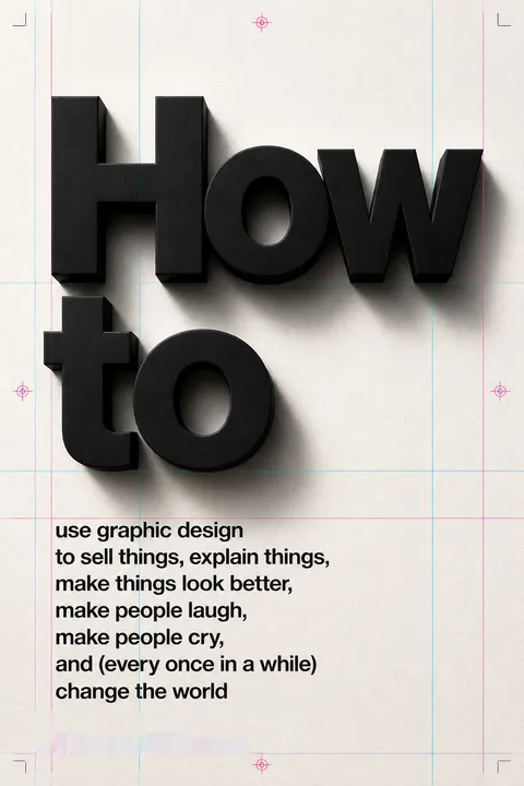
How to use graphic design to sell things, explain things, make people laugh, make people cry, and (every once in a while) change the world receives mostly positive reviews, with readers appreciating Bierut's straightforward approach and diverse portfolio. Many find the book inspiring and insightful, offering a behind-the-scenes look at design processes. Some readers expected more instructional content but still found value in the examples and stories. The book is praised for its visual appeal and Bierut's writing style. Critics note it's more of a showcase of his work than a how-to guide, but still recommend it for both experienced designers and those curious about the field.
FAQ
1. What is "How to use graphic design to sell things, explain things, make things look better, make people laugh, make people cry, and (every once in a while) change the world" by Michael Bierut about?
- Comprehensive design memoir: The book is a collection of essays and case studies from Michael Bierut’s four-decade career as a graphic designer.
- Practical and philosophical: It explores both the practical aspects of design projects and the philosophical questions about the role and impact of graphic design.
- Project-based structure: Each chapter focuses on a specific project or theme, illustrating how design can influence everything from branding to public spaces.
- Personal journey: Bierut shares his personal evolution, influences, and the lessons learned from mentors, clients, and collaborators.
2. Why should I read "How to use graphic design to sell things..." by Michael Bierut?
- Insider’s perspective: The book offers a rare, candid look into the real-world process of design from one of the industry’s most respected practitioners.
- Broad appeal: It’s valuable for designers, students, marketers, business owners, and anyone interested in creativity and communication.
- Inspirational stories: Bierut’s anecdotes about successes, failures, and unexpected outcomes provide motivation and practical wisdom.
- Actionable insights: Readers gain concrete advice on creativity, client relationships, and the power of design to shape perceptions and experiences.
3. What are the key takeaways from "How to use graphic design to sell things..." by Michael Bierut?
- Design is problem-solving: Graphic design is about finding creative solutions within constraints, not just making things look pretty.
- Content over style: The best design ideas are rooted in strong concepts and content, rather than superficial aesthetics.
- Consistency matters: Building a recognizable identity often comes from consistent application of simple elements, not just logos.
- Design’s real-world impact: Even small design decisions can have far-reaching consequences, as seen in projects like the infamous "butterfly ballot."
4. What is Michael Bierut’s approach to graphic design as described in the book?
- Embrace constraints: Bierut thrives on challenging briefs and believes that limitations fuel creativity.
- Iterative process: He values sketching, note-taking, and generating many ideas before settling on a solution.
- Collaboration and listening: Successful projects often come from close collaboration with clients and being open to their input.
- Purpose-driven design: Bierut emphasizes that design should serve a function—whether to inform, persuade, or delight—not just exist for its own sake.
5. How does Michael Bierut define the role and power of graphic design in "How to use graphic design to sell things..."?
- Communication tool: Graphic design is a means to communicate ideas, values, and information effectively to a wide audience.
- Agent of change: While design can’t save the world alone, it can inspire, empower, and provide tools for people to make a difference.
- Invisible influence: Good design often goes unnoticed but shapes our experiences, decisions, and even major events (e.g., election ballots).
- Emotional impact: Design can evoke laughter, tears, and a sense of connection, making it a powerful force in culture and society.
6. What are some of the most influential projects or case studies featured in "How to use graphic design to sell things..."?
- Brooklyn Academy of Music (BAM): Created a visual identity without a traditional logo, using consistent typography to build recognition.
- Saks Fifth Avenue: Transformed a dated script logo into a modular, endlessly variable system for packaging and branding.
- New York City’s WalkNYC: Helped design a citywide wayfinding system that blends analog and digital mapping conventions.
- The Doomsday Clock: Advised the Bulletin of the Atomic Scientists to use their iconic clock as a logo, showing design’s role in public awareness.
7. What specific advice does Michael Bierut give to aspiring designers in "How to use graphic design to sell things..."?
- Find your own path: There’s no single way to become a designer; follow your interests and be open to unexpected opportunities.
- Practice relentlessly: Mastery comes from hard work, repetition, and learning from both successes and failures.
- Value collaboration: Build relationships with mentors, clients, and peers; great work often comes from teamwork.
- Stay curious: Be interested in as many things as possible—design is a way to learn about the world.
8. How does "How to use graphic design to sell things..." address the concept of identity and branding?
- Beyond the logo: Bierut argues that identity is more than a logo; it’s about consistent, recognizable choices applied over time.
- Case studies: Projects like BAM and Saks Fifth Avenue illustrate how identity can be built through typography, color, and repetition.
- Flexibility and consistency: The book explores balancing timelessness with adaptability, as seen in the MIT Media Lab’s dynamic logo system.
- Authenticity: The best identities reflect the true character and values of the organization, not just surface-level design.
9. What does Michael Bierut say about the relationship between style and substance in graphic design?
- Style is inevitable: Every designer has a style, but it should serve the content and purpose of the project.
- Content is king: Bierut’s favorite solutions are those where the idea drives the form, not the other way around.
- Transcending trends: He encourages designers to move beyond chasing trends and focus on meaningful, lasting solutions.
- Personal evolution: The book documents Bierut’s own journey from imitating others’ styles to finding his own voice through substance.
10. How does "How to use graphic design to sell things..." illustrate the impact of design on society and culture?
- Election design: The Palm Beach "butterfly ballot" case shows how poor design can have massive, unintended consequences.
- Public spaces: Projects like WalkNYC and Governors Island signage demonstrate how design shapes how people navigate and experience cities.
- Cultural institutions: Work for museums, universities, and media outlets highlights design’s role in education, arts, and public discourse.
- Everyday life: The book reveals how design touches everything from restaurant menus to airline branding, influencing daily experiences.
11. What are the best quotes from "How to use graphic design to sell things..." and what do they mean?
- “Inspiration is for amateurs. The rest of us just show up and get to work.” – Emphasizes the importance of discipline and routine over waiting for inspiration.
- “A logo is an empty vessel awaiting the meaning that will be poured into it by history and experience.” – Reminds us that logos gain significance over time through use and association.
- “No one can tell you what to do. But once you decide, the real fun is figuring out how to do it.” – Encourages self-direction and the joy of creative problem-solving.
- “Design can’t save the world. Only people can do that. But design can give us the inspiration, the tools, and the means to try.” – A humble but optimistic view of design’s potential.
12. How does Michael Bierut’s use of notebooks and process sketches inform his design philosophy in "How to use graphic design to sell things..."?
- Thinking with your hands: Bierut documents decades of using composition books for notes, sketches, and ideas, showing the value of analog thinking.
- Process over perfection: Many ideas start as rough sketches or lists, evolving through trial, error, and iteration.
- Visual memory: Notebooks serve as a personal archive, revealing how early thoughts often anticipate later design solutions.
- Integration of words and images: Bierut’s process blends verbal and visual thinking, reinforcing his belief that design is about communication, not just decoration.
Download PDF
Download EPUB
.epub digital book format is ideal for reading ebooks on phones, tablets, and e-readers.


