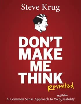
Key Takeaways
1. Don't make users think: Design for intuitive navigation
If you can make something self-evident, you at least need to make it self-explanatory.
Intuitive design is key. Users shouldn't have to figure out how your website works. Every element, from buttons to menus, should be immediately understandable. When users encounter something unfamiliar, they should be able to grasp its purpose quickly without much mental effort.
Clarity trumps cleverness. Avoid using clever names or obscure terminology for navigation elements. Stick to clear, descriptive labels that users can understand at a glance. For example, use "Jobs" instead of "Career Opportunities" or "Employment" for a job listings section.
Eliminate question marks. Every time a user has to pause and think about how something works, it adds to their cognitive load. Strive to eliminate these mental speed bumps by:
- Using familiar design patterns and conventions
- Providing clear and concise instructions when needed
- Ensuring that clickable elements look clickable
- Using descriptive headings and subheadings
2. Users don't read, they scan: Optimize for quick comprehension
We know now from a very elegant experiment that a lot happens as soon as you open a page.
Users are impatient. Most people don't read web pages word-by-word; they scan for relevant information. This behavior is even more pronounced on mobile devices. To accommodate this, design your content for quick comprehension:
- Use clear, descriptive headings and subheadings
- Break up text into short paragraphs
- Utilize bullet points and numbered lists
- Highlight key terms and important information
- Use meaningful images and diagrams to support the text
Front-load important information. Put the most crucial content at the beginning of paragraphs, headings, and page sections. This "inverted pyramid" style of writing helps users quickly find what they're looking for without having to read everything.
3. Create clear visual hierarchies to guide users
A good visual hierarchy saves us work by preprocessing the page for us, organizing and prioritizing its contents in a way that we can grasp almost instantly.
Visual hierarchy is crucial. A well-designed visual hierarchy helps users understand the relative importance of page elements and how they're related. This makes it easier for users to find what they're looking for and understand the overall structure of your site.
Key principles for creating effective visual hierarchies:
- Make important elements larger, bolder, or in a distinctive color
- Group related items visually (e.g., by proximity or similar styling)
- Use whitespace to separate unrelated elements
- Nest items to show what's part of what
Consistency is important. Maintain a consistent visual hierarchy across your site to help users learn and remember how to navigate. This includes using consistent styling for headings, links, and other important elements.
4. Break pages into clearly defined areas for easy scanning
Dividing the page into clearly defined areas is important because it allows users to decide quickly which areas of the page to focus on and which areas they can safely ignore.
Chunking improves comprehension. By breaking your page into distinct sections, you make it easier for users to quickly understand the page's structure and find the information they need. This is especially important for long pages or pages with diverse content.
Strategies for creating clearly defined areas:
- Use different background colors or borders to separate sections
- Employ consistent spacing between different types of content
- Utilize headings and subheadings to delineate sections
- Consider using a grid-based layout for organized content presentation
Prioritize content. Place the most important information in the areas where users are most likely to look first, typically the top-left corner for left-to-right reading cultures. Use eye-tracking studies and heatmaps to inform your layout decisions.
5. Make it obvious what's clickable to improve usability
Since a large part of what people are doing on the Web is looking for the next thing to click, it's important to make it easy to tell what's clickable.
Clear affordances are crucial. Users should never have to wonder whether something is clickable. Use visual cues to make interactive elements stand out:
- Style links consistently (e.g., underlined or in a distinct color)
- Make buttons look clickable with depth, shadows, or hover effects
- Use familiar icons for standard actions (e.g., a magnifying glass for search)
Consider mobile interactions. On touch devices, ensure that clickable elements are large enough and spaced adequately for easy tapping. The recommended minimum touch target size is 44x44 pixels.
Provide feedback. Use hover effects on desktop and press states on mobile to give users visual feedback when they interact with clickable elements. This reinforces the element's interactivity and provides a sense of control.
6. Design effective navigation: Use conventions and clear signposts
Web navigation compensates for this missing sense of place by embodying the site's hierarchy, creating a sense of "there."
Navigation is crucial. Good navigation helps users understand what's on your site, how it's organized, and how to find what they're looking for. It also gives them confidence in your site and organization.
Key elements of effective navigation:
- Clear, descriptive labels for navigation items
- Consistent placement of navigation elements across the site
- Visual indication of the current location (e.g., highlighting the active page in the menu)
- Breadcrumbs for deep hierarchies
- A prominent search function
Use familiar patterns. Stick to common navigation conventions unless you have a very good reason not to. Users are accustomed to certain patterns, like primary navigation at the top of the page or in a left sidebar.
Provide multiple paths. Offer different ways to access content, such as through main navigation, search, and contextual links within content. This accommodates different user preferences and browsing styles.
7. Simplify forms and eliminate needless words
Get rid of half the words on each page, then get rid of half of what's left.
Concise content is key. Every unnecessary word on your page makes the useful content more difficult to find. Be ruthless in editing your content, focusing on clarity and brevity.
Strategies for simplifying content:
- Use plain language and avoid jargon
- Break long paragraphs into shorter ones
- Replace long explanations with examples where possible
- Use bulleted or numbered lists for easy scanning
- Eliminate redundant information
Streamline forms. Forms are often a major source of friction for users. To improve form usability:
- Only ask for essential information
- Group related fields together
- Use clear, specific labels for form fields
- Provide helpful error messages and inline validation
- Show progress indicators for multi-step forms
8. Conduct simple usability tests to identify and fix problems
Testing one user is 100 percent better than testing none.
Regular testing is crucial. Usability testing doesn't have to be expensive or time-consuming. Even small, informal tests can reveal significant issues and insights.
How to conduct simple usability tests:
- Recruit 3-5 participants who represent your target audience
- Create realistic tasks for them to complete on your site
- Ask participants to think aloud as they complete the tasks
- Observe and take notes on their behavior and comments
- Identify common issues and prioritize fixes
Focus on major issues. Don't get bogged down in minor details. Concentrate on fixing the most significant problems that prevent users from completing important tasks.
Test early and often. Incorporate usability testing throughout the design process, not just at the end. This allows you to catch and fix issues before they become deeply ingrained in your design.
9. Mobile design: Focus on speed, simplicity, and touch-friendly interfaces
It's all about tradeoffs.
Mobile-first design is essential. With the increasing prevalence of mobile devices, designing for small screens and touch interactions is crucial. This approach forces you to focus on the most important content and functionality.
Key considerations for mobile design:
- Prioritize content and features rigorously
- Design for touch: use large, well-spaced tap targets
- Optimize for speed: minimize page load times and use progressive loading
- Simplify navigation: consider using a "hamburger" menu or bottom navigation bar
- Use responsive design to adapt to different screen sizes
Consider context. Mobile users may have different needs and behaviors than desktop users. Design for on-the-go scenarios while still providing access to all important features.
10. Accessibility: Make your site usable for everyone
It's the right thing to do. And not just the right thing; it's profoundly the right thing to do, because the one argument for accessibility that doesn't get made nearly often enough is how extraordinarily better it makes some people's lives.
Accessibility benefits everyone. Designing for accessibility not only helps users with disabilities but often improves usability for all users. It's also increasingly becoming a legal requirement in many jurisdictions.
Key accessibility considerations:
- Provide alternative text for images
- Ensure keyboard navigation is possible for all functions
- Use sufficient color contrast for text and important elements
- Structure content with proper heading hierarchy
- Make forms accessible with clear labels and error messages
- Provide captions and transcripts for multimedia content
Start with the basics. Even small improvements in accessibility can make a big difference. Focus on the most critical issues first, such as proper heading structure and image alt text, and build from there.
11. Build goodwill by being considerate of users' needs and time
I've always found it useful to imagine that every time we enter a Web site, we start out with a reservoir of goodwill.
User satisfaction is cumulative. Every positive interaction builds goodwill, while negative experiences deplete it. Strive to create a positive overall experience by being considerate of users' needs and time.
Ways to build goodwill:
- Be upfront about important information (e.g., pricing, shipping costs)
- Provide clear, honest error messages and help users recover from mistakes
- Offer easily accessible customer support options
- Minimize the steps required to complete common tasks
- Respect users' privacy and be transparent about data usage
Anticipate user needs. Try to understand what users want to accomplish on your site and make those tasks as easy as possible. This might involve providing shortcuts, remembering user preferences, or offering contextual help.
Continuously improve. Regularly gather user feedback and analytics data to identify pain points and areas for improvement. Show users that you value their input by addressing common issues and implementing requested features when appropriate.
Last updated:
FAQ
What's "Don't Make Me Think, Revisited" about?
- Focus on Usability: The book is a guide to web usability, emphasizing the importance of designing websites that are intuitive and easy to navigate.
- Krug’s First Law: It introduces Krug’s First Law of Usability: "Don’t make me think," which suggests that web pages should be self-evident and self-explanatory.
- Practical Advice: It provides practical advice and principles for creating user-friendly websites, applicable to both web and mobile design.
- Real-World Examples: The book uses real-world examples and illustrations to demonstrate effective and ineffective web design practices.
Why should I read "Don't Make Me Think, Revisited"?
- Improve User Experience: It offers insights into improving the user experience on websites, which is crucial for retaining visitors and achieving business goals.
- Simplified Concepts: The book breaks down complex usability concepts into simple, actionable steps that anyone can follow.
- Broad Applicability: While focused on web design, the principles can be applied to any interactive design, including apps and software.
- Engaging Style: Steve Krug’s engaging writing style, with humor and wit, makes the book an enjoyable read.
What are the key takeaways of "Don't Make Me Think, Revisited"?
- Self-Evident Design: Aim for designs that are self-evident, reducing the cognitive load on users.
- Usability Testing: Regular usability testing is crucial; even simple tests can reveal significant insights.
- Guiding Principles: Follow conventions, create clear visual hierarchies, and eliminate unnecessary elements to enhance usability.
- User-Centric Approach: Always design with the user in mind, ensuring that their needs and expectations are met.
What is Krug’s First Law of Usability?
- "Don’t Make Me Think": This principle emphasizes that web pages should be obvious and self-explanatory.
- Reduce Cognitive Load: The goal is to minimize the amount of thinking users need to do to understand and navigate a site.
- Immediate Understanding: Users should be able to grasp the purpose and functionality of a page at a glance.
- Design Clarity: Achieving this requires clear, intuitive design and navigation.
How does "Don't Make Me Think, Revisited" suggest improving web navigation?
- Consistent Navigation: Use persistent navigation elements that appear on every page to help users orient themselves.
- Clear Hierarchies: Establish a clear visual hierarchy to guide users through the site’s content.
- Breadcrumbs and Tabs: Implement breadcrumbs and tabs to show users their location and options within the site.
- User-Friendly Labels: Ensure that page names and navigation labels are clear and match what users expect.
What is the importance of usability testing according to Steve Krug?
- Early Testing: Conduct usability testing early and often to catch issues before they become costly to fix.
- Simple and Effective: Even simple, informal tests can provide valuable insights into user behavior and site issues.
- Focus on Major Issues: Prioritize fixing the most significant usability problems first to improve the overall user experience.
- Involve Stakeholders: Encourage team members and stakeholders to observe tests to understand user challenges firsthand.
What are some best practices for mobile usability mentioned in the book?
- Responsive Design: Ensure your site is usable on all screen sizes, from desktops to mobile devices.
- Prioritize Content: Focus on the most important content and features for mobile users, considering their context and needs.
- Visible Affordances: Make interactive elements like buttons and links clearly visible and distinguishable.
- Allow Zooming: Ensure users can zoom in on content to improve readability and interaction on small screens.
How does "Don't Make Me Think, Revisited" address accessibility?
- Inclusive Design: Emphasizes the importance of making websites accessible to all users, including those with disabilities.
- Simple Adjustments: Suggests simple changes like adding alt text to images and ensuring keyboard navigation to improve accessibility.
- Usability and Accessibility: Highlights that improving general usability often enhances accessibility for users with disabilities.
- Moral Obligation: Argues that making sites accessible is the right thing to do, as it significantly improves some users' lives.
What are some of the best quotes from "Don't Make Me Think, Revisited" and what do they mean?
- "Don’t make me think!" - This encapsulates the book’s core message that web design should be intuitive and effortless for users.
- "It’s not rocket surgery." - Usability doesn’t have to be complex; simple, common-sense approaches can lead to significant improvements.
- "Focus ruthlessly on fixing the most serious problems first." - Prioritize addressing the biggest usability issues to make the most impact.
- "Usability is about people and how they understand and use things, not about technology." - The focus should always be on the user experience, not just the technical aspects.
How does Steve Krug suggest handling web design debates?
- Avoid Religious Debates: Recognize that many design arguments are based on personal preferences rather than user needs.
- Test to Resolve: Use usability testing to settle debates by focusing on what works for users rather than opinions.
- Focus on Users: Keep the user’s experience at the forefront to guide design decisions and avoid unnecessary conflicts.
- Embrace Diversity: Understand that users are diverse, and design should accommodate a range of preferences and behaviors.
What is the "Trunk Test" in "Don't Make Me Think, Revisited"?
- Navigation Check: The Trunk Test is a method to evaluate if a page’s navigation is clear and intuitive.
- Key Elements: Ensure that users can easily identify the site ID, page name, sections, local navigation, and search options.
- Quick Assessment: The test involves quickly assessing a page to see if these elements are immediately apparent.
- User Orientation: It helps ensure that users can orient themselves and navigate the site without confusion.
How does "Don't Make Me Think, Revisited" suggest dealing with visual noise?
- Reduce Clutter: Eliminate unnecessary elements that distract users from the main content and navigation.
- Clear Hierarchy: Use visual hierarchy to guide users’ attention to the most important parts of the page.
- Consistent Design: Maintain consistency in design elements to avoid overwhelming users with too much information.
- Focus on Content: Prioritize content that supports users’ goals and remove anything that doesn’t add value.
Review Summary
Don't Make Me Think, Revisited is highly regarded for its practical approach to web usability. Readers praise Krug's clear, humorous writing style and actionable advice. The book emphasizes simplicity, intuitive design, and user-centric thinking. While some find it basic or outdated, many consider it essential reading for web designers and developers. Key concepts include making interfaces self-explanatory, understanding how users actually navigate sites, and the importance of usability testing. The book's principles are seen as timeless, though some examples may be dated.
Similar Books





Download PDF
Download EPUB
.epub digital book format is ideal for reading ebooks on phones, tablets, and e-readers.
