Key Takeaways
1. Understand your audience and context before visualizing data
There is a story in your data. But your tools don't know what that story is. That's where it takes you—the analyst or communicator of the information—to bring that story visually and contextually to life.
Know your audience. Before diving into data visualization, clearly identify who your audience is and what they need to know or do. This understanding shapes every decision you'll make in crafting your message. Consider:
- Who is your specific audience? (e.g., decision-makers, team members, clients)
- What is their level of familiarity with the subject?
- What action do you want them to take after seeing your data?
Clarify your purpose. Determine the key message you want to convey and how your data supports it. Use tools like:
- The "Big Idea": A concise, one-sentence summary of your main point
- The "3-minute story": A brief overview that captures the essence of your message
- Storyboarding: A visual outline of your content to establish structure
By investing time in understanding context upfront, you'll create more focused, impactful data visualizations that resonate with your audience and drive action.
2. Choose the right visual display for your data and message
The answer is always the same: whatever will be easiest for your audience to read.
Match form to function. The type of data you have and the story you want to tell should guide your choice of visual display. Consider these common options:
- Tables: Best for precise, lookup values or mixed units of measure
- Line graphs: Ideal for showing trends over time
- Bar charts: Excellent for comparing categories
- Scatterplots: Useful for showing relationships between variables
Avoid unnecessary complexity. Simpler charts are often more effective:
- Limit the use of pie charts, as they can be difficult to interpret accurately
- Avoid 3D effects, which can distort data perception
- Be cautious with dual-axis charts, as they can be confusing
Remember that your choice of visual should make it easier for your audience to grasp the key information quickly. If you're unsure, test different options with colleagues to see which one communicates most clearly.
3. Eliminate clutter to enhance clarity and focus
Because it makes our visuals appear more complicated than necessary.
Simplify ruthlessly. Every element in your visualization should serve a purpose. Identify and remove anything that doesn't directly contribute to understanding:
- Gridlines (or make them very light)
- Redundant labels
- Excessive decimal places
- Ornamental graphics or borders
Use white space strategically. Don't feel compelled to fill every inch of your canvas. White space:
- Helps direct attention to important elements
- Makes your visualization feel less overwhelming
- Improves overall readability
Emphasize through de-emphasis. Instead of making important elements stand out, try muting everything else. This can be a more subtle and effective way to guide your audience's focus.
By decluttering, you reduce the cognitive load on your audience, allowing them to more quickly and easily grasp the key insights from your data visualization.
4. Use preattentive attributes to guide attention effectively
If we use preattentive attributes strategically, they can help us enable our audience to see what we want them to see before they even know they're seeing it!
Leverage visual cues. Preattentive attributes are visual properties that our brains process almost instantaneously, before conscious attention. Use them to highlight key information:
- Color: Use sparingly to draw attention to important data points
- Size: Make critical elements larger
- Position: Place important information where the eye naturally looks first (often top-left)
- Shape: Use distinct shapes to differentiate categories
Create visual hierarchy. Combine preattentive attributes to guide your audience through the information in a specific order:
- Primary focus: Use the strongest visual cues
- Secondary information: Apply more subtle differentiation
- Context: Keep supporting details visible but de-emphasized
Be intentional with color. Color is a powerful tool, but overuse diminishes its impact:
- Choose a single accent color for emphasis
- Use color consistently throughout your visualization
- Consider colorblind-friendly palettes
By strategically applying preattentive attributes, you can direct your audience's attention and create a clear visual path through your data story.
5. Apply design principles for accessible and aesthetic visuals
Form follows function.
Prioritize accessibility. Ensure your visualizations are easily understood by a wide audience:
- Use clear, legible fonts
- Provide sufficient contrast between text and background
- Include descriptive titles and labels
- Avoid relying solely on color to convey information
Create visual appeal. Aesthetically pleasing designs are perceived as easier to use and more credible:
- Align elements to create a sense of order
- Use consistent styling (fonts, colors, spacing) throughout
- Balance white space and content
Consider your medium. Adapt your design for different formats:
- Presentations: Simpler visuals with less text
- Reports: More detailed visualizations with supporting explanations
- Interactive dashboards: Allow for exploration while guiding key insights
Remember that good design should feel effortless to the viewer. If your audience is focusing on the design itself rather than the content, you may need to simplify further.
6. Craft a compelling narrative to bring your data to life
Stories resonate and stick with us in ways that data alone cannot.
Structure your story. Use classic storytelling elements to engage your audience:
- Beginning: Set the context and introduce the problem
- Middle: Present your data and analysis
- End: Conclude with insights and call to action
Create tension. Highlight the gap between the current situation and a desired outcome to maintain interest:
- What problem does your data address?
- Why should your audience care?
- What could be improved or changed?
Use narrative techniques:
- Repetition: Reinforce key points
- Analogies: Make complex concepts relatable
- Specific examples: Bring data to life with real-world applications
Remember, your data should support your story, not be the story itself. Focus on the "so what" – why the information matters and what actions it should drive.
7. Iterate and seek feedback to refine your data story
There is incredible value in getting a fresh perspective when it comes to communicating with data in general.
Embrace iteration. Your first attempt is rarely your best. Plan time for multiple revisions:
- Create quick drafts to explore different approaches
- Step away and return with fresh eyes
- Be willing to start over if a new idea proves more effective
Seek diverse feedback. Different perspectives can uncover blind spots and improve clarity:
- Colleagues familiar with the subject matter
- People outside your field (to test general understanding)
- If possible, members of your target audience
Test comprehension. Ask reviewers specific questions:
- What do you think the main message is?
- What questions do you have after seeing this?
- What would you do differently based on this information?
Use the insights gained from feedback to refine your visualization and narrative. Remember that the goal is effective communication, not perfection. Continuous improvement through iteration will help you develop stronger data storytelling skills over time.
Last updated:
FAQ
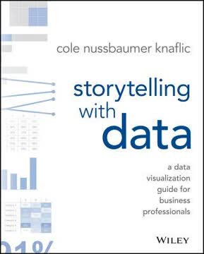
What's "Storytelling with Data" about?
- Purpose: "Storytelling with Data" by Cole Nussbaumer Knaflic is a guide for business professionals on how to effectively communicate data through visualization.
- Focus: The book emphasizes the importance of storytelling in data presentation, aiming to transform raw data into compelling narratives.
- Audience: It is written for anyone who needs to communicate data-driven insights, including analysts, managers, and leaders.
- Structure: The book is organized into lessons that cover understanding context, choosing visuals, eliminating clutter, focusing attention, thinking like a designer, and telling a story.
Why should I read "Storytelling with Data"?
- Improve Communication: It provides practical strategies to enhance your ability to communicate complex data clearly and effectively.
- Professional Edge: Mastering data storytelling can set you apart in the workplace, as it is a skill increasingly in demand.
- Broad Applicability: The lessons are applicable across various industries and roles, making it a versatile resource.
- Engaging Content: The book is filled with real-world examples and case studies that make the concepts relatable and easy to understand.
What are the key takeaways of "Storytelling with Data"?
- Understand Context: Before visualizing data, know your audience and what you want them to learn or do.
- Choose Effective Visuals: Select the right type of graph or chart to best convey your message.
- Eliminate Clutter: Remove unnecessary elements that do not add value to your data visualization.
- Tell a Story: Use narrative techniques to make your data more engaging and memorable.
How does Cole Nussbaumer Knaflic suggest choosing an effective visual?
- Visual Types: The book discusses various types of visuals like line graphs, bar charts, and scatterplots, and when to use each.
- Avoid Common Pitfalls: It advises against using pie charts, 3D effects, and secondary y-axes due to their potential to mislead.
- Consider Audience Needs: Choose visuals that are easy for your audience to understand and interpret.
- Practical Examples: The book provides examples of before-and-after visualizations to illustrate effective choices.
What is the importance of context in "Storytelling with Data"?
- Audience Understanding: Knowing who your audience is and what they need to know is crucial for effective communication.
- Purpose Clarity: Clearly define what you want your audience to do with the information you present.
- Data Relevance: Select data that supports your narrative and is relevant to your audience's needs.
- Consultation: The book suggests asking questions to stakeholders to fully understand the context before creating visuals.
How does "Storytelling with Data" address clutter in data visualization?
- Cognitive Load: Clutter increases cognitive load, making it harder for the audience to understand the data.
- Gestalt Principles: The book uses Gestalt principles to identify and eliminate unnecessary elements.
- Visual Order: It emphasizes the importance of alignment, white space, and contrast to create a clean visual.
- Step-by-Step Decluttering: Provides a process for systematically removing clutter from visuals.
How can preattentive attributes be used to focus attention according to "Storytelling with Data"?
- Definition: Preattentive attributes are visual properties that the brain processes quickly, such as color, size, and position.
- Attention Direction: Use these attributes to guide the audience's focus to the most important parts of the data.
- Visual Hierarchy: Create a hierarchy of information to lead the audience through the data in a logical order.
- Practical Application: The book provides examples of how to apply these attributes effectively in data visualization.
What does "Storytelling with Data" say about thinking like a designer?
- Form Follows Function: Design your visuals to serve the purpose of your communication effectively.
- Affordances: Use design elements that make it obvious how the audience should interact with the data.
- Aesthetics Matter: Aesthetic designs are perceived as easier to use and more engaging.
- Audience Acceptance: Strategies are provided for gaining acceptance of new or different visual designs.
How does "Storytelling with Data" suggest telling a story with data?
- Narrative Structure: Use a clear beginning, middle, and end to structure your data story.
- Conflict and Tension: Introduce conflict to engage your audience and drive the narrative.
- Repetition: Use repetition to reinforce key points and help them stick in the audience's memory.
- Practical Tactics: The book offers tactics like horizontal and vertical logic to ensure clarity in storytelling.
What are some of the best quotes from "Storytelling with Data" and what do they mean?
- "There is a story in your data." This emphasizes the book's core message that data should be transformed into a narrative to be impactful.
- "Clutter is your enemy." Highlights the importance of removing unnecessary elements to make data visualization clear and effective.
- "Think like a designer." Encourages readers to apply design principles to make data more accessible and engaging.
- "Tell a story." Reinforces the idea that storytelling is a powerful tool for making data memorable and actionable.
How does "Storytelling with Data" address the use of color in data visualization?
- Strategic Use: Color should be used sparingly and strategically to highlight important data points.
- Consistency: Maintain consistent use of color throughout a presentation to avoid confusing the audience.
- Colorblind Considerations: Design with colorblind audiences in mind, avoiding problematic color combinations like red and green.
- Tone and Emotion: Be mindful of the tone that colors convey and choose them to match the message.
What are some practical examples or case studies from "Storytelling with Data"?
- Dark Backgrounds: The book discusses how to adjust visuals for dark backgrounds to maintain readability and focus.
- Animation Use: It provides strategies for using animation in presentations to guide audience attention.
- Order Logic: Emphasizes the importance of logical order in data presentation to facilitate understanding.
- Spaghetti Graphs: Offers solutions for avoiding cluttered line graphs by emphasizing one line at a time or separating them spatially.
Review Summary
Storytelling with Data receives mostly positive reviews for its practical advice on creating clear, impactful data visualizations. Readers appreciate the step-by-step guidance, before-and-after examples, and focus on storytelling. Many find it useful for beginners and business professionals. Some criticize it for being too basic or lacking depth in certain areas. Overall, reviewers recommend it as a valuable resource for improving data communication skills, though a few note it may not be as helpful for those already experienced in the field.
Similar Books


Download PDF
Download EPUB
.epub digital book format is ideal for reading ebooks on phones, tablets, and e-readers.


