Key Takeaways
Design a real feature first, never the empty app shell
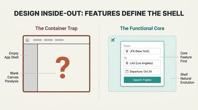
Stop designing the container. When people sit down to "design an app," they instinctively start with the shell: top nav or sidebar, logo placement, full-width or contained content. Wathan and Schoger call this a trap. An app is really a collection of features, and until you have designed a few of them, you lack the information to make shell decisions intelligently. No wonder the blank canvas feels paralyzing.
Start with functionality instead. Building a flight-booking service? Design the flight search first: departure city, destination, dates, and a search button. Get that working. Google's homepage proved you may not even need the surrounding chrome. Build the smallest useful slice, ship it, then let the navigation reveal what it actually needs to be.
This mirrors a broader principle in product thinking: form follows function, an axiom borrowed from architect Louis Sullivan. What's compelling is how it reframes designer's block not as a creativity deficit but as an information deficit. You are stuck because you are guessing. The advice dovetails with agile development's aversion to big up-front design and with Basecamp's shape-up methodology. One caveat worth noting: some products genuinely are navigation-first, like a content portal or a dashboard hub, where wayfinding is the core value. But even there, the underlying logic holds: design the thing users came for before the scaffolding around it.
Design in grayscale first so spacing and contrast carry the load
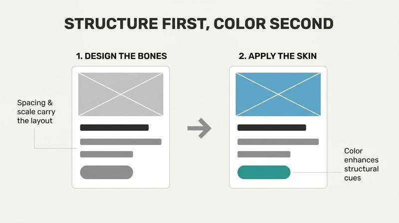
Withhold color and detail deliberately. In early stages, resist agonizing over typefaces, shadows, and icons. Jason Fried of Basecamp famously sketches with a thick Sharpie precisely because it makes fussing over pixels impossible, forcing rapid exploration of layouts. Even when moving to higher fidelity, hold off on color.
Grayscale forces stronger bones. By designing without color, you must lean on spacing, contrast, and size to establish hierarchy. It is harder, but it yields a clearer interface with strong structure that color later enhances rather than rescues. Treat sketches and wireframes as disposable: users cannot do anything with a static mockup, so explore, decide, and abandon them fast. The goal of low fidelity is speed toward building the real thing.
There is real cognitive science here. Color is a powerful pre-attentive attribute, meaning the brain processes it almost instantly, which is exactly why introducing it early lets it mask structural weaknesses. Strip it away and a muddy hierarchy has nowhere to hide. Photographers and painters use the same discipline, checking value studies in black and white before committing to palette. The Sharpie trick is a constraint-as-creativity device, echoing research on how limitations boost divergent thinking. The only tension: some products, like data visualization or brand-driven marketing, encode meaning in color from the start, so grayscale purity has diminishing returns for them.
Replace infinite options with tight systems you define once
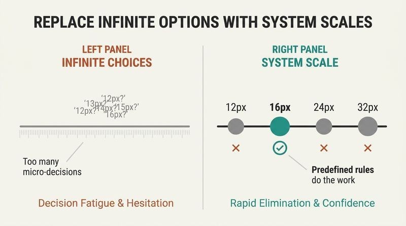
Choice is a curse, not a luxury. Faced with millions of colors and every pixel value, designers waste hours deciding between 12px and 13px, or 10% versus 15% shadow opacity. When any of several answers is defensible, confident decisions become impossible. The book's remedy is to constrain yourself in advance.
Build systems, then eliminate. Predefine restricted scales for everything: font size, weight, line height, color, margin, padding, width, height, shadows, border radius, opacity. Then design by process of elimination. Choosing an icon size from 12, 16, 24, and 32px? Guess 16, then compare against the neighbors on either side. Usually two options are obviously wrong, leaving one clear winner. Doing the hard work once, up front, saves you from decision fatigue on every future screen.
This is Barry Schwartz's paradox of choice applied to craft: more options reduce satisfaction and stall action. The genius move is converting an open-ended optimization problem into a small multiple-choice test, which the human brain handles far better. Design tokens and systems like Material Design institutionalize exactly this. There is a deeper productivity lesson too: constraints are not the enemy of good work, they are the precondition for it, a theme running from Stravinsky's composition rules to Twitter's original character limit. The 25% spacing rule that follows is the mathematical backbone that makes each step in a scale perceptibly distinct.
Hierarchy, not talent, is what makes an interface look designed
Rank every element by importance. The single biggest factor in "looking good" is not superficial styling but visual hierarchy: how important elements appear relative to one another. When everything competes for attention, the result is a noisy wall of content. Deliberately de-emphasize secondary and tertiary information and the same layout, colors, and fonts suddenly feel professional.
Stop over-relying on font size. Instead of making primary text huge and secondary text tiny, recruit weight and color. Use a bold weight at a reasonable size for emphasis, and a softer grey for supporting text. Stick to roughly three text colors (dark for primary, grey for secondary, lighter grey for tertiary) and two weights (normal at 400 to 500, bold at 600 to 700). Avoid weights under 400 for UI text.
This is the book's philosophical heart: it democratizes design by relocating skill from innate artistry to a learnable decision framework. The claim aligns with information-design research from Edward Tufte, whose principle of "layering and separation" argues that visual distinction should encode informational importance. The counterbalance technique, using contrast to tame heavy icons or weight to strengthen thin borders, reflects a sophisticated understanding that perceived emphasis is about surface area of ink, not any single property. One nuance: hierarchy is culturally and contextually loaded. What reads as primary depends on user goals, so the designer must first know what the user is scanning for before ranking anything.
Ditch labels and let format and context speak for the data
The label-colon-value trap flattens everything. Displaying database data as naive "Label: value" pairs gives every field equal weight, killing hierarchy. Often you need no label at all: [email protected] is obviously an email, $19.99 is obviously a price, and "Customer Support" under a name obviously means a department.
Fold labels into values, or demote them. When format alone is not enough, absorb the label into the value: "In stock: 12" becomes "12 left in stock"; "Bedrooms: 3" becomes "3 bedrooms." When you genuinely need labels for scannable dashboards, treat them as supporting content: smaller, lighter, lower contrast. The exception is spec-heavy pages where users scan for the label itself ("depth," not "7.6mm"); there, emphasize the label modestly while keeping the data legible.
This reflects a linguistics insight: humans decode meaning from schema and pattern recognition, not explicit tagging. A phone number's shape is itself a signal. The advice extends copywriting into interface design, treating microcopy as a first-class hierarchy tool rather than decoration, a stance shared with content-design pioneers like Sarah Winters. The friendly opening line about the "accessibility pitchfork" acknowledges a real tension worth flagging: form inputs genuinely do need programmatic labels for screen readers, even when visually hidden. The lesson applies to displayed data, not interactive controls, and conflating the two could harm users who rely on assistive technology.
More breathing room fixes ugly faster than any other move
Subtract white space, do not add it. The default web workflow adds margin only until something stops looking actively bad, leaving elements with the bare minimum room. Flip it: start with far too much space, then remove until it feels right. What looks like "a little too much" around a single element usually reads as "just enough" in the full interface.
Stop trying to fill the screen. High-resolution monitors tempt designers to fill 1200 to 1400px, but if content needs only 600px, use 600px. Spreading things out makes interfaces harder to parse. Shrink your canvas to design mobile-first, split wide layouts into columns rather than stretching them, and give each element only the width it needs. Grids are overrated: fixed-width sidebars often beat fluid percentages that shrink content below usability.
Negative space is not emptiness; it is an active compositional force, a principle central to Japanese aesthetics (ma) and to classical typography. Empirically, generous whitespace improves comprehension and perceived elegance, though studies also show it can reduce information density that power users want, which is why the book carves out dashboards as a deliberate exception. The "remove, don't add" reframe is behaviorally shrewd: it changes the default anchor point, and anchoring is one of the most robust findings in cognitive psychology. The critique of grids is bracing but measured, targeting dogmatic percentage-based layouts rather than grids themselves, which remain useful for genuinely fluid content.
Build hand-picked type and spacing scales that jump at least 25%
Linear scales fail; ratios and hand-tuning win. A rule like "multiples of 4px" does not help you choose between 120 and 125px. Useful scales account for relative difference: no two adjacent values should sit closer than about 25%, because a 4px jump matters enormously at small sizes (12 to 16px is a 33% leap) and is invisible at large ones (500 to 520px is 4%).
Anchor on 16px and reject em units for scales. Start at 16px, the browser default that divides cleanly, and build outward. Modular scales using ratios like 1.618 are mathematically seductive but produce fractional pixels and too-few sizes for UI work, so hand-crafted scales usually win. Avoid em units for type scales: because em is relative to the parent, nested elements compute to values that fall outside your system entirely. Use px or rem.
The 25% threshold is essentially a nod to the Weber-Fechner law, which holds that the just-noticeable difference between two stimuli is proportional, not absolute. A scale honoring that law guarantees every step is perceptibly distinct, which is why the advice feels so right in practice. The critique of modular scales is refreshingly pragmatic against the design world's romance with the golden ratio, echoing skepticism from mathematicians who note the ratio's aesthetic supremacy is largely folklore. The em-unit warning is a genuinely technical gotcha that trips up even experienced developers, and rem exists precisely to solve the compounding-inheritance problem it describes.
Switch from hex to HSL to reason about color like a human
Hex hides relationships HSL reveals. In hex or RGB, two visually similar colors look nothing alike in code. HSL describes color the way the eye perceives it: hue (position on the color wheel in degrees, 0 red, 120 green, 240 blue), saturation (0% grey to 100% vivid), and lightness (0% black, 50% pure color, 100% white). Do not confuse it with HSB, whose brightness behaves differently; browsers speak HSL.
You need far more colors than a palette generator gives you. Five hex codes build nothing real. A working palette needs 8 to 10 greys, 5 to 10 shades each of one or two primaries, plus accent colors for states like red (destructive), yellow (warning), and green (positive). Define every shade up front rather than generating them on the fly with "lighten" and "darken" functions.
HSL's advantage is that it maps onto human perceptual dimensions, making it a genuine cognitive tool rather than mere notation, though it is worth knowing that even HSL is not perceptually uniform, which is why modern color science increasingly favors spaces like OKLCH that correct for the eye's uneven sensitivity. The book's own insight that yellow reads lighter than blue at identical HSL lightness is precisely the flaw those newer spaces fix. The war on "lighten/darken" functions is sound: algorithmic shading produces muddy, desaturated results because it ignores that saturation must climb as lightness moves toward the extremes, a subtlety the manual nine-shade method (100 to 900) handles with care.
Fake depth by pretending light always falls from above
One rule creates every raised or inset effect. Our brains assume light comes from above, so we read edges accordingly. A raised element has a lighter top edge (angled toward the sky) and casts a small, sharp, dark shadow below, blocking light. An inset "well" reverses this: a shadow at the top where the lip blocks light, a lighter bottom edge angled upward. Keep blur radii tight, just a few pixels, like the crisp shadow under a window frame.
Shadows position elements on a z-axis. Bigger, softer shadows pull elements closer to the user and grab more attention: small shadows for buttons, medium for dropdowns, large for modals. The nicest shadows use two layers: a large soft one simulating cast light, and a tight dark one simulating ambient occlusion beneath the object. Even flat designs convey depth through lighter-equals-closer color and overlapping layers.
The overhead-light assumption is a genuine perceptual heuristic documented in vision science: subjects shown ambiguous shaded circles overwhelmingly interpret them as convex when lit from above, a bias so strong it survives image rotation. Skeuomorphism thus is not arbitrary nostalgia but an exploitation of hardwired neural priors. The two-shadow technique maps directly onto how computer graphics separates direct illumination from ambient occlusion, meaning the book is teaching a simplified version of physically based rendering. The elevation-as-attention idea also anticipates Material Design's z-axis system. A worthwhile caution: overdoing realism produces busy, dated interfaces, which is why the authors repeatedly urge restraint over photorealism.
Never let color be the only carrier of meaning
Colorblind users need a second signal. Roughly one in twelve men is red-green colorblind, so metric cards that show good-versus-bad only through red and green fail them entirely. The fix is cheap: add an up or down icon alongside the color. For multi-line graphs, lean on contrast (light versus dark) rather than distinct hues, since brightness differences survive colorblindness far better than color differences.
Accessible need not mean ugly. WCAG asks for a 4.5:1 contrast ratio on normal text and 3:1 on large text. White text on a colored background often forces the background uncomfortably dark, stealing attention. Flip the contrast: dark colored text on a light colored background keeps things readable and calm. For colored text on colored panels, rotate the hue toward a brighter color like cyan or yellow to hit contrast without fading to white.
The principle that color must support, never solely convey, meaning is codified in WCAG's "use of color" criterion, and its reach extends beyond disability: it protects users on glare-washed phone screens, cheap projectors, and grayscale printouts, a robustness argument that reframes accessibility as universal design rather than charity. The hue-rotation trick for hitting contrast ratios is clever precisely because it exploits the perceptual-brightness variance across hues noted earlier. What elevates this section is its refusal to treat accessibility as a compliance tax that ruins aesthetics. The reframe, that constraints breed better solutions, is the same creative philosophy animating the entire book, now pointed at inclusion.
Respect every image's intended size and tame uploads with cropping
Scaling betrays you in both directions. Bad photos sink good designs, so hire a pro or use quality stock like Unsplash, and never plan to swap in smartphone shots later. Beyond quality, size matters: icons drawn at 16 to 24px look chunky and detail-starved when blown up 3x, so nest them inside a shape with a background color instead. Conversely, shrinking a full screenshot by 70% crams a 16px font down to an unreadable 4px, so shoot at tablet size, crop a partial view, or draw a simplified UI with lines standing in for text.
Guard against user-uploaded chaos. You cannot control users' photos, so center them in fixed containers with background-size cover to crop overflow. When an upload's background matches your UI and bleeds together, skip the clashing border and use a subtle inner box shadow or semi-transparent inner border to preserve the image's shape.
The core idea, that assets have an intended size and violating it looks amateur, generalizes a truth from typography and cartography: detail must match display scale, which is why map labels and icon sets are hand-tuned per zoom level rather than mechanically scaled. Favicons are the extreme case, and the advice to redraw rather than downsample echoes how professional icon families ship distinct optical versions per size. The user-upload section is quietly the most practical, since it addresses the gap between a designer's pristine mockup and production reality, where real content is messy. Defensive design, assuming inputs will be hostile, is a discipline borrowed straight from robust software engineering.
Sharpen your eye by rebuilding interfaces you admire from scratch
Polish hides in the finishing touches. Small moves add professional flair: swap plain bullets for icons (checkmarks, or a padlock for security features), promote testimonial quotes into large colored elements, add accent borders along a card's top or an alert's edge, and decorate flat backgrounds with subtle gradients (hues no more than 30 degrees apart) or low-contrast patterns. Never ship a boring empty state; it is the user's first impression of a feature, so add an illustration and a strong call to action. And reach for borders less: box shadows, differing background colors, or extra spacing often separate elements more elegantly.
Grow by reverse-engineering. Study designs you love and ask what the designer did that you never would have thought to do. Then rebuild your favorite interfaces from scratch without peeking at dev tools; the frustration of matching the original teaches tricks like tightening heading line-height or spacing uppercase text.
The rebuild-from-scratch method is deliberate practice in Anders Ericsson's precise sense: it isolates the gap between your output and an expert benchmark, then forces effortful correction, which is exactly how skill compounds. Copying to learn has a long pedigree, from Renaissance apprentices reproducing masters to programmers reimplementing algorithms. What makes it potent here is the no-peeking constraint, which converts passive admiration into active problem-solving and surfaces the invisible micro-decisions that separate polished work from adequate work. The "decisions you wouldn't have made" prompt is a lightweight heuristic for expanding one's own design vocabulary, essentially crowdsourcing taste from the best work already in the wild.
Analysis
Refactoring UI is a manifesto disguised as a tactics manual. Its radical premise is that visual design, long mystified as the province of the innately gifted, is actually a decision system that non-designers (chiefly developers) can learn. Wathan and Schoger, the team behind Tailwind CSS, wrote the book that explains the worldview underlying that framework: constrain your choices, systematize your values, and let a small number of learnable principles do the heavy lifting.
The book's intellectual coherence comes from a single recurring insight applied across domains: good design is subtraction and constraint, not addition and freedom. Remove white space rather than add it. Limit colors and sizes to predefined scales. Design in grayscale before color. Withhold labels. Use fewer borders. Nearly every chapter is a variation on the theme that fewer, more deliberate options produce better and faster work. This is a genuinely contrarian stance in a culture that fetishizes creative freedom, and it aligns with robust findings in decision science about choice overload and anchoring.
The treatment of hierarchy is the book's deepest contribution, reframing "looking good" as "correctly ranking importance," which relocates skill from talent to method. The color chapters (HSL over hex, perceived brightness, saturation compensation) are the most technically sophisticated, teaching applied color science that most designers absorb only through years of trial.
Limitations exist. The advice is optimized for clean, conversion-oriented web SaaS products; it says little about motion, complex data visualization, or richly branded editorial work. Its aesthetic, restrained, systematic, slightly generic, has become so influential that it now risks producing homogeneous interfaces. And the color spaces it champions are already being superseded by perceptually uniform alternatives. Still, as a bridge from "I can't design" to "I have a repeatable process," it remains unusually effective, precisely because it trades inspiration for procedure.
Review Summary
Refactoring UI receives overwhelmingly positive reviews, with readers praising its practical, concise approach to UI design. Many find it especially valuable for developers looking to improve their design skills. The book is lauded for its clear examples, useful tips, and ability to explain complex concepts simply. Readers appreciate its focus on creating consistent, functional designs and building effective design systems. While some experienced designers find it basic, most consider it an essential resource for anyone involved in web or app development, regardless of their design background.
People Also Read


Glossary
Visual hierarchy
Ranking elements by relative importanceThe perceived importance of interface elements relative to one another, controlled through size, weight, color, contrast, and spacing. The book argues it is the single most powerful lever for making a design look professional, achieved largely by de-emphasizing secondary and tertiary content so the most important elements stand out, rather than by adding decorative styling.
Emphasize by de-emphasizing
Highlight by muting competitorsA technique for making an element stand out not by adding emphasis to it, but by reducing the visual weight of the elements competing with it. For example, softening the color of inactive nav items or removing a sidebar's background color so the main content dominates.
Spacing and sizing system
Predefined constrained value scaleA fixed, non-linear scale of spacing and sizing values defined in advance, typically anchored at 16px, where no two adjacent values sit closer than about 25%. It replaces arbitrary pixel-tweaking with quick selection from a limited set, speeding workflow and enforcing consistency.
HSL
Hue, saturation, lightness color modelA way of representing color using three human-perceptible attributes: hue (position on the color wheel in degrees), saturation (vividness from grey to intense), and lightness (from black through pure color to white). The book recommends it over hex or RGB because visually related colors have visibly related values, and because browsers understand it natively.
Perceived brightness
Hue's inherent apparent lightnessThe observation that different hues appear lighter or darker even at identical HSL lightness (yellow looks lighter than blue). Because of this, brightness can be adjusted by rotating hue toward bright hues (60, 180, 300 degrees) or dark hues (0, 120, 240 degrees), letting a color change lightness without losing intensity, ideally within 20 to 30 degrees.
Emulate a light source
Fake depth via overhead lightA depth technique based on the brain's assumption that light comes from above. Raised elements get a lighter top edge and a small sharp shadow below; inset elements reverse this with a shadow at the top and a lighter bottom edge. Mimicking real-world lighting makes flat pixels read as raised or recessed.
Two-part shadow
Layered cast and ambient shadowA realistic shadow built from two overlaid shadows: a large, soft, offset shadow simulating light cast behind an object, plus a tighter, darker shadow simulating ambient occlusion directly beneath it. The tight shadow should fade as an element's elevation increases, mirroring how contact shadows vanish with distance.
Labels are a last resort
Let format and context speakThe principle that data should be presented without explicit labels wherever format (an email, a price) or context makes meaning clear, or by folding the label into the value ("12 left in stock"). When labels are truly needed, they are treated as secondary supporting content rather than given equal weight to the data.
FAQ
What's "Refactoring UI" about?
- Design principles for developers: "Refactoring UI" by Adam Wathan provides practical design advice specifically tailored for developers who may not have formal design training.
- Focus on UI improvement: The book emphasizes improving user interfaces by focusing on hierarchy, layout, color, and typography.
- Actionable tips and techniques: It offers actionable tips and techniques to make interfaces more visually appealing and user-friendly.
- Systematic approach: The book encourages a systematic approach to design, helping readers create consistent and efficient UI designs.
Why should I read "Refactoring UI"?
- Enhance design skills: If you're a developer looking to improve your design skills, this book provides clear, practical guidance.
- Bridge the gap: It helps bridge the gap between development and design, making it easier to create aesthetically pleasing and functional interfaces.
- Time-saving techniques: The book offers time-saving techniques and systems that streamline the design process.
- Real-world examples: It includes real-world examples and case studies that illustrate the application of design principles.
What are the key takeaways of "Refactoring UI"?
- Start with features: Begin designing with a focus on features rather than the overall layout to avoid frustration and inefficiency.
- Hierarchy is crucial: Establish a clear visual hierarchy to make interfaces more intuitive and user-friendly.
- Limit choices: Define systems for colors, fonts, and spacing to reduce decision fatigue and maintain consistency.
- Emphasize simplicity: Avoid over-designing and focus on creating the simplest useful version of a feature.
How does "Refactoring UI" suggest starting a design?
- Feature-first approach: Start with a specific feature rather than the entire layout to gather necessary information for design decisions.
- Example of flight booking: For a flight booking service, begin with the search functionality, including fields for departure and destination cities.
- Avoid shell design: Avoid starting with the app's shell, such as navigation bars, until features are defined.
- Iterative process: Use an iterative process to refine features and layout as more information becomes available.
What does "Refactoring UI" say about visual hierarchy?
- Not all elements are equal: Recognize that not all elements in an interface hold the same importance and should be styled accordingly.
- Use size wisely: Avoid relying solely on size to establish hierarchy; use font weight and color to emphasize important elements.
- De-emphasize to emphasize: Sometimes, de-emphasizing less important elements can make the main elements stand out more.
- Separate visual and document hierarchy: Ensure that visual hierarchy is distinct from document hierarchy to maintain clarity.
How does "Refactoring UI" recommend using color?
- Ditch hex for HSL: Use HSL color values for more intuitive adjustments based on hue, saturation, and lightness.
- More colors than expected: Prepare a comprehensive palette with multiple shades for greys, primary, and accent colors.
- Define shades upfront: Establish a fixed set of shades to avoid inconsistencies and maintain a cohesive color scheme.
- Accessible design: Ensure color choices meet accessibility standards without compromising aesthetics.
What does "Refactoring UI" suggest about layout and spacing?
- Start with too much space: Begin with excessive white space and reduce it to achieve a clean and balanced design.
- Establish a spacing system: Use a non-linear scale for spacing and sizing to simplify decisions and maintain consistency.
- Don't fill the screen: Avoid using the entire screen width unnecessarily; give elements the space they need.
- Grids are overrated: Use fixed widths for elements when appropriate, rather than relying solely on fluid grid systems.
How does "Refactoring UI" address typography?
- Establish a type scale: Define a type scale with a range of font sizes to ensure consistency and speed up decision-making.
- Avoid em units: Use px or rem units for font sizes to maintain consistency across different contexts.
- Good font selection: Choose fonts with multiple weights and optimize for legibility, especially for UI text.
- Line length and alignment: Keep line lengths between 45-75 characters and align text for readability.
What are some design systems recommended in "Refactoring UI"?
- Color systems: Define a comprehensive color palette with multiple shades for each color to maintain consistency.
- Typography systems: Establish a type scale with specific font sizes and weights to streamline text styling.
- Spacing systems: Use a non-linear scale for spacing and sizing to simplify layout decisions.
- Shadow systems: Define a set of shadows to convey elevation and depth consistently across the UI.
How does "Refactoring UI" suggest creating depth in design?
- Emulate a light source: Use light and shadow to create the illusion of depth, making elements appear raised or inset.
- Shadows for elevation: Use shadows to position elements on a virtual z-axis, enhancing the sense of depth.
- Flat design depth: Even in flat designs, use color and solid shadows to convey depth without relying on gradients or textures.
- Overlap elements: Create layers by overlapping elements, adding a sense of depth and complexity to the design.
What does "Refactoring UI" say about working with images?
- Use high-quality photos: Choose professional or high-quality stock photos to enhance the design.
- Consistent text contrast: Ensure text on images maintains consistent contrast for readability.
- Intended size for images: Use images at their intended size to avoid quality loss and maintain clarity.
- User-uploaded content: Control the shape and size of user-uploaded images to maintain layout integrity.
What are the best quotes from "Refactoring UI" and what do they mean?
- "Start with a feature, not a layout": Focus on designing specific features first to gather necessary information for layout decisions.
- "Hierarchy is everything": Establishing a clear visual hierarchy is crucial for making interfaces intuitive and user-friendly.
- "Limit your choices": Define systems for design elements to reduce decision fatigue and maintain consistency.
- "Accessible doesn’t have to mean ugly": Ensure designs meet accessibility standards without compromising aesthetics.
Download PDF
Download EPUB
.epub digital book format is ideal for reading ebooks on phones, tablets, and e-readers.


